Best Icon Libraries for React
React is a versatile JavaScript library used for building user interfaces, and the right set of icons can significantly enhance the aesthetics and usability of a React application. This blog explores top icon libraries for React, focusing on simplicity, versatility, and ease of use.
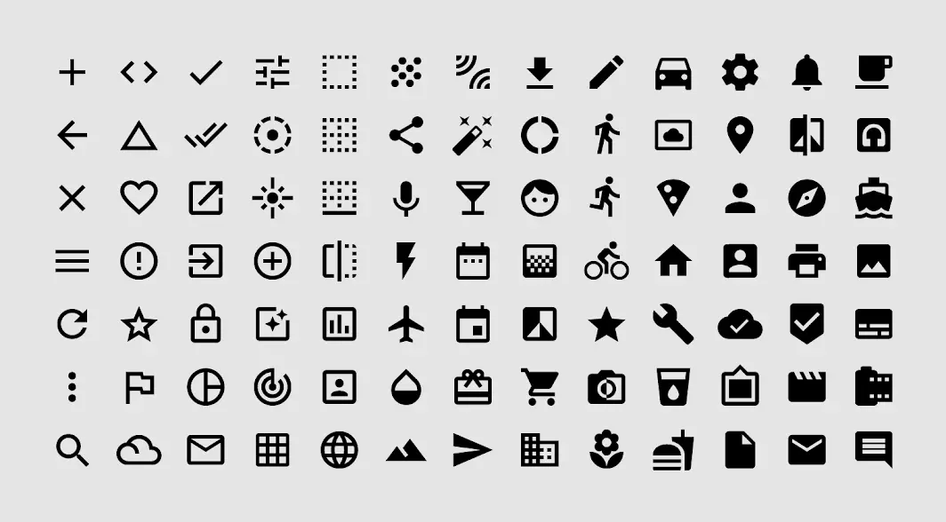
1. Hero Icons
Hero Icons are a set of free, high-quality SVG icons crafted by the creators of Tailwind CSS. They are known for their simplicity and elegance, making them a perfect fit for modern web designs.
Typical Usage: Ideal for projects that require clean and minimalistic icons. They’re often used in Tailwind CSS projects due to their seamless integration.
Installation
npm install @heroicons/reactUsage
import { BeakerIcon } from '@heroicons/react/24/outline'

function MyComponent() {
  return <BeakerIcon className="h-5 w-5 text-blue-500" />
}
Explore Hero Icons further: Hero Icons Docs 🌟
2. React Icons
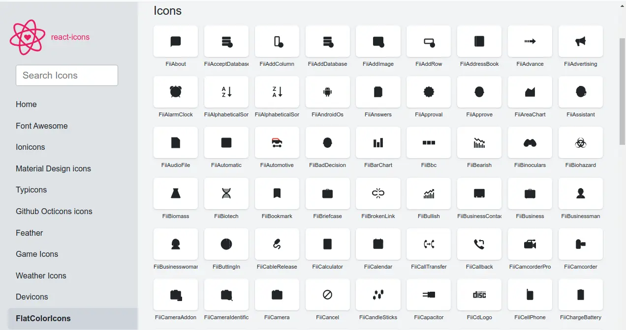
React Icons incorporates a diverse range of icon sets, including Font Awesome, Ionicons, Material Design Icons, and more. This library is particularly noteworthy for its extensive collection, offering over 10,000 icons.
Typical Usage: Suitable for projects that require a wide variety of icons. It’s particularly useful when you need icons from different sets without wanting to install multiple packages.
Interesting Fact: React Icons allows you to import icons individually, helping to keep bundle sizes small.
Installation
npm install react-iconsUsage
import { FaBeer } from 'react-icons/fa';

function MyComponent() {
  return <h3> Let's have a <FaBeer />! </h3>
}
Discover more on React Icons: React Icons Docs 🎨
3. Material Icons
Material Icons are Google’s icon set, created as part of the Material Design system. These icons are delightful and beautifully crafted, offering a consistent look and feel.
Typical Usage: Best for projects following Material Design principles. They are widely used in Android apps and web applications that aim for a material look.
Interesting Fact: Material Icons are part of a larger design system developed by Google, which includes guidelines for layout, color schemes, interactions, and more.
Installation
npm install @mui/icons-materialUsage
import AccessAlarmIcon from '@mui/icons-material/AccessAlarm';

function MyComponent() {
  return <AccessAlarmIcon />
}
Delve into Material Icons: Material Icons Docs 📚
4. Ionicons
Ionicons offer a comprehensive set of icons for web, iOS, Android, and desktop applications. Designed for the Ionic Framework but not limited to it, they fit well in many different types of projects.
Typical Usage: Great for cross-platform app development. They provide a consistent iconography for web and mobile apps.
Interesting Fact: Initially developed for Ionic Framework, Ionicons have gained popularity beyond the Ionic ecosystem due to their versatility.
Installation
npm install ioniconsUsage
import { arrowBackOutline } from 'ionicons/icons';

function MyComponent() {
  return <ion-icon name={arrowBackOutline}></ion-icon>
}
Learn about Ionicons: Ionicons Docs 🔍
5. Font Awesome
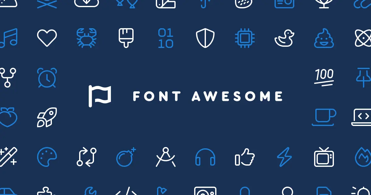
Font Awesome offers a comprehensive set of icons suitable for various web-related applications, from small personal blogs to large-scale commercial sites.
Typical Usage: Font Awesome is used in a variety of web projects, from small personal blogs to large-scale commercial sites.
Interesting Fact: Font Awesome was one of the early icon libraries to adopt a web font approach, allowing icons to be scaled and styled easily with CSS.
Installation
npm install @fortawesome/fontawesome-svg-core
npm install @fortawesome/free-solid-svg-icons
npm install @fortawesome/react-fontawesome
Usage
import { FontAwesomeIcon } from '@fortawesome/react-fontawesome'
import { faCoffee } from '@fortawesome/free-solid-svg-icons'

function MyComponent() {
  return <FontAwesomeIcon icon={faCoffee} />
}
Find out about Font Awesome: Font Awesome Docs ✨
6. Feather Icons
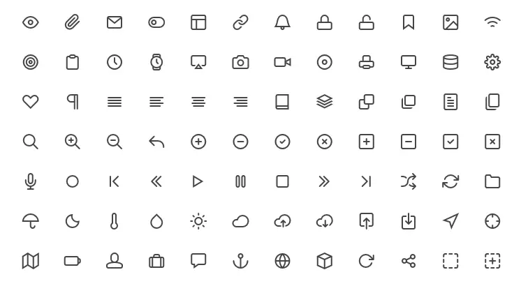
Feather Icons are beautifully simple open-source icons, designed with an emphasis on simplicity and readability.
Typical Usage: Ideal for modern web interfaces that require lightweight and clean icons. They are particularly popular in minimalist and contemporary designs.
Interesting Fact: Feather Icons place an emphasis on stroke width and roundness, giving them a distinctive and consistent look across the set.
Installation
npm install feather-icons-reactUsage
import { Camera } from 'feather-icons-react';

function MyComponent() {
  return <Camera />
}
Investigate Feather Icons: Feather Icons Docs 🕊️
Conclusion
When choosing icon libraries for your React project, consider your design needs, the project’s aesthetic, and the user experience you aim to create. With the right icons, your application can achieve both functionality and flair. Use phrases like “best React icon libraries” and “enhance UI/UX with React icons” in your conclusion for better SEO.